Introduction
In the real estate industry, first impressions play a major role in shaping how a brand is perceived. A professionally designed logo is not just a visual element; it is a key part of building trust, credibility, and a strong identity in a competitive market.
For Solos Real Estate, MAX4Design created a logo that reflects a modern and professional image while staying simple, memorable, and meaningful. The goal was to develop a visual identity that communicates confidence and leaves a lasting impression
Overview
The main objective of this project was to create a logo that represents:
- Stability and trust
- Professionalism in the real estate sector
- A modern and memorable visual identity
To achieve this, the MAX4Design team followed a clear and thoughtful design process that included:
- Market and competitor analysis
- Brand personality definition
- Target audience research
Several design directions were explored before choosing the final concept. The selected direction successfully combined minimalism with strong symbolic meaning, resulting in a logo that feels both modern and relevant to the real estate market.
The final design includes:
- A geometric structure inspired by architecture
- Clean, modern typography
- A balanced composition that reinforces visual stability
The color palette was also carefully selected to support the brand’s message:
- Dark blue: trust and reliability
- Teal: growth and innovation
- White: clarity and simplicity
Logo Case Study
Design Concept
The logo symbol was developed to capture the essence of real estate through a clean and structured visual form. It reflects:
- Architectural elements that suggest buildings and real estate development
- A subtle integration of the initial letter in an abstract way
- A clear sense of balance, structure, and stability
Beyond its architectural feel, the concept was also inspired by the form of an hourglass, symbolizing growth, progress, and the value of time in building something meaningful.
In this concept:
- The upper third represents innovation and vision
- The lower two-thirds represent effort, consistency, and continuous giving
This relationship between vision and hard work reflects the mindset behind successful real estate investment and long-term value creation.
Geometric Construction
The geometric construction of the logo was an important part of its strength. Sharp angles and structured lines were used to communicate precision, confidence, and professionalism. At the same time, the balanced proportions of the design help create a sense of stability, which is essential for a real estate brand.
Typography
A modern geometric typeface was chosen to complement the symbol and strengthen the overall identity. This choice helped ensure:
- High readability
- A clean and professional appearance
- Seamless integration with the icon
The typography supports the symbol without overpowering it, creating a refined and balanced final result.
Color Psychology
The chosen colors were not random; they were selected to reinforce the brand message and strengthen the emotional impact of the logo:
- Blue conveys trust and credibility
- Teal represents growth and forward-thinking
- White enhances clarity and simplicity
Together, these colors create a professional and modern look that aligns well with the expectations of the real estate market.
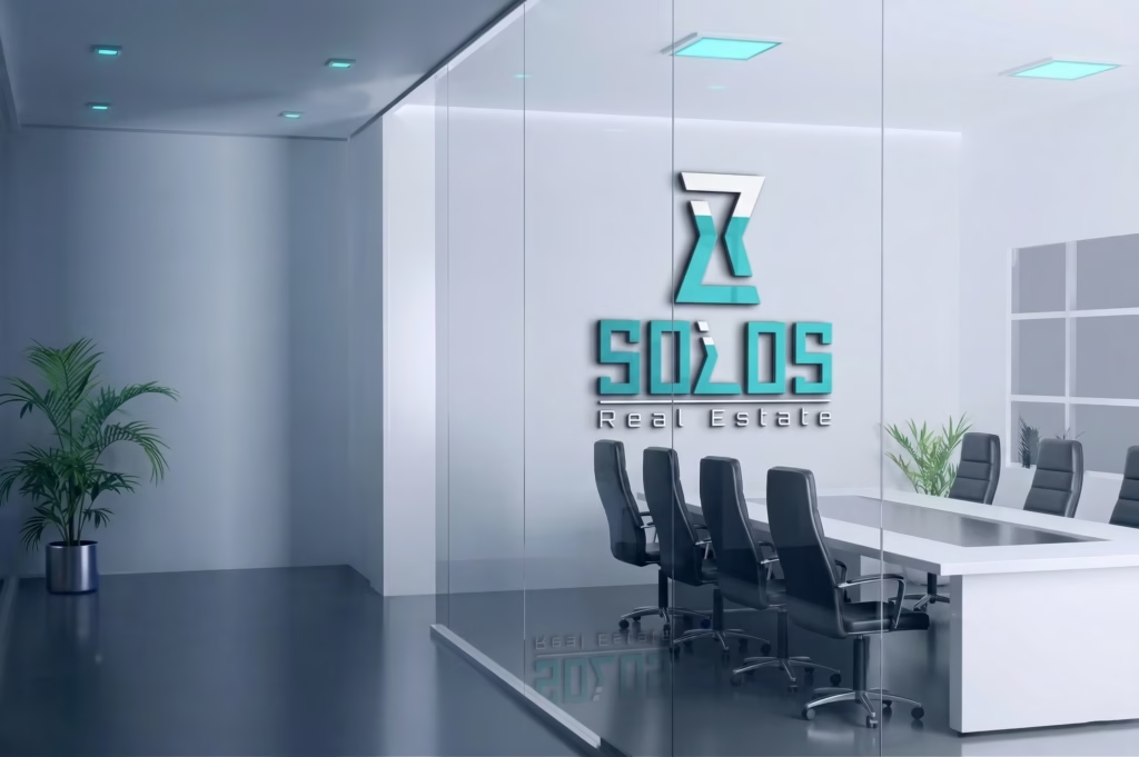
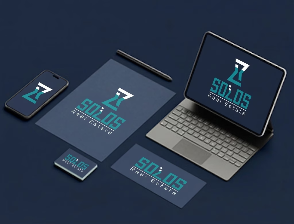
Scalability & Versatility
A successful logo must work across different formats and applications. For this reason, the Solos Real Estate logo was designed to remain clear and effective in a wide range of uses, including:
- Small sizes such as icons and mobile apps
- Large-scale applications such as billboards and signage
- Both print and digital branding materials
Its clean structure and balanced form make it highly versatile and easy to apply across different brand touchpoints.
What Makes This Logo Unique
What gives this logo its unique value is the way it combines simplicity with meaning. It is more than just a clean mark; it is a carefully developed identity element that communicates the right message for the brand.
Key strengths of the logo include:
- A professional logo design tailored for real estate brands
- A smart combination of symbol and lettermark
- A clean and modern minimal style
- High versatility across all branding materials
- A strong visual identity that builds trust
Summary
MAX4Design created a professional and distinctive logo for Solos Real Estate through a strategic and creative design process. The final result is a strong visual identity that supports the brand’s credibility, reflects its values, and helps it stand out in the market.
Conclusion
A logo is far more than a decorative element. It is a strategic part of how a brand presents itself and how people remember it. With the Solos Real Estate project, MAX4Design delivered a logo that combines clarity, professionalism, and concept-driven design to create a lasting brand impression.
At MAX4Design, the focus is not only on creating attractive visuals, but on building brand identities that communicate real value and long-term strength.