Introduction
As part of our work in branding and visual identity design, we at Max4Design created a custom logo for AXON with a modern style that reflects professionalism and simplicity, supported by a thoughtful visual concept that enhances the brand’s uniqueness and memorability.
Article Content:
At Max4Design, we believe that a successful logo is not only about visual appeal, but also about having a clear idea that expresses the brand’s personality in a smart and direct way. That is why the AXON logo was designed to combine visual simplicity with a strong identity in a balanced and modern composition.
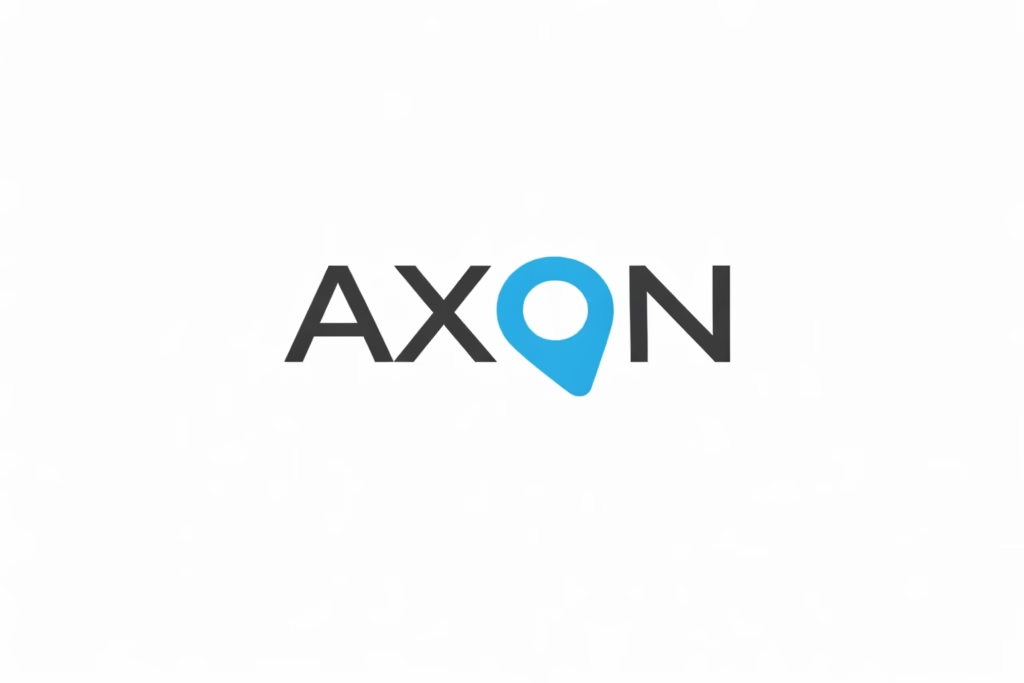
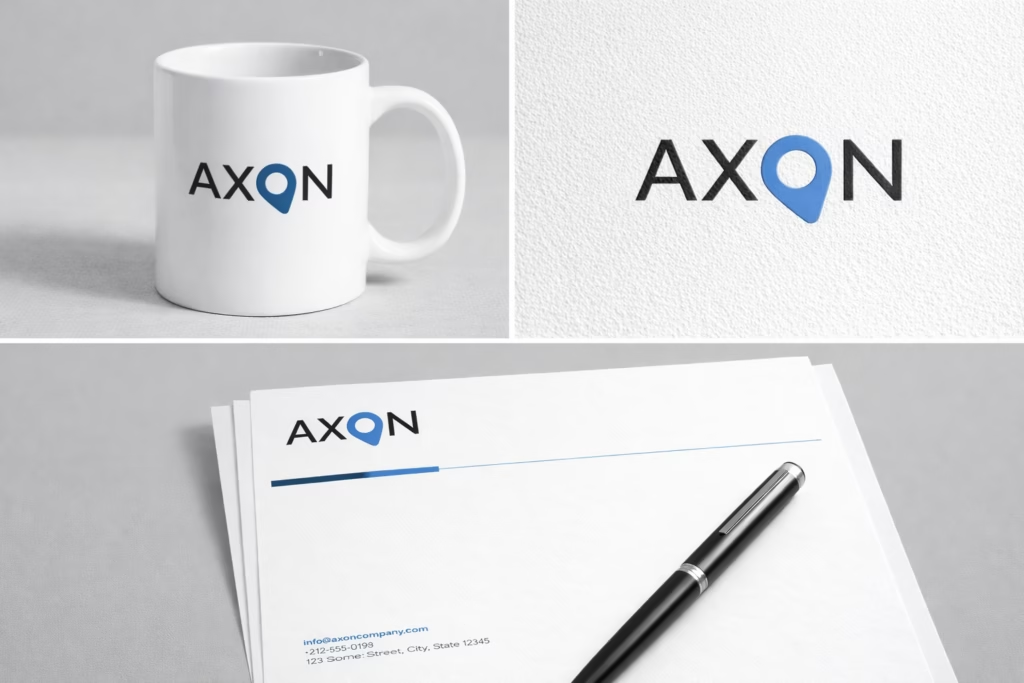
In this project, we used a clean and cohesive typographic design, while integrating a distinctive visual element within the word itself to give the logo a unique and memorable character. The main idea was to incorporate a symbol inspired by a location pin into the logo, representing several important meanings such as precision, direction, destination, focus, and reaching the right point. This integration added not only visual value, but also a conceptual depth that strengthens the logo’s presence and makes it more distinctive.
From a color perspective, we relied on blue as the key element within the logo. Blue carries strong meanings such as trust, professionalism, stability, and innovation, and it is also visually associated with the digital and technological world, making it an ideal choice for a modern and contemporary identity. The use of white in the remaining parts of the logo reinforces clarity, simplicity, and cleanliness, while creating an elegant visual balance against the dark background.
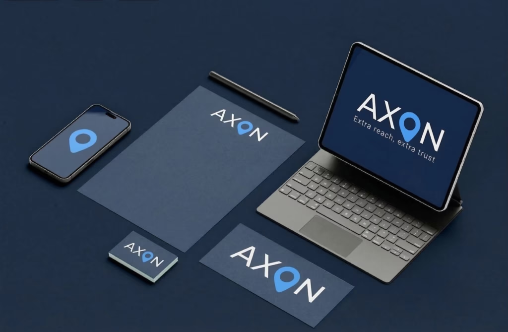
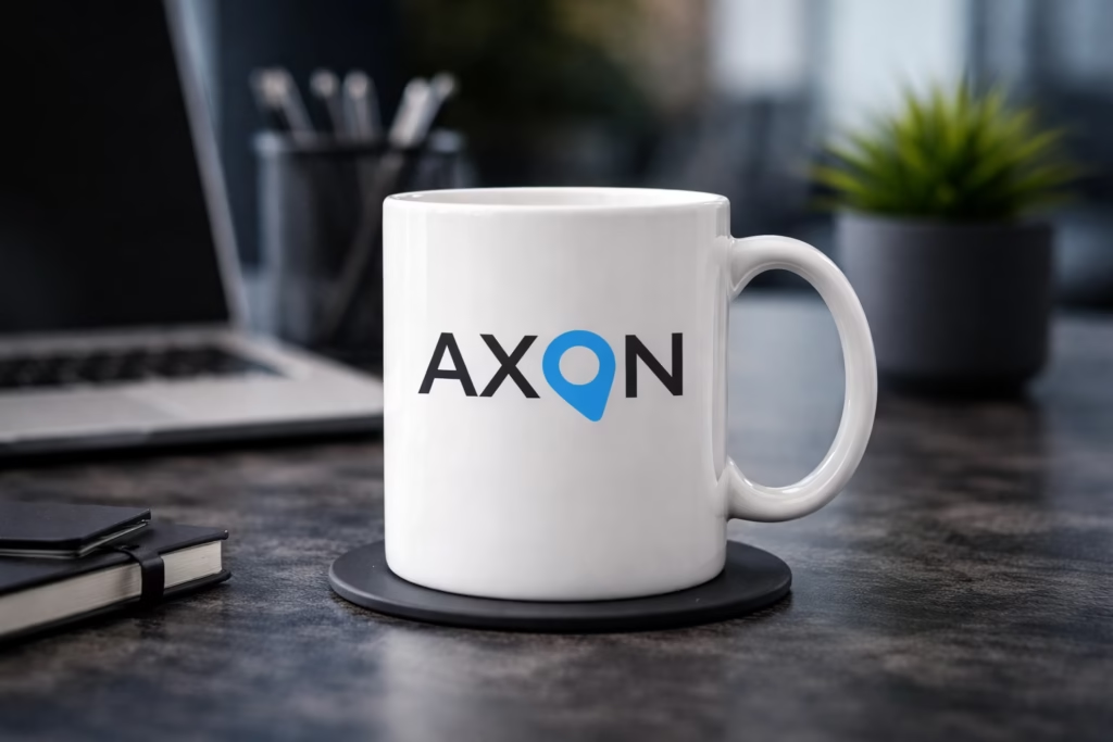
This contrast between blue and white over a dark background helps the logo stand out in a bold and refined way, giving it a strong visual presence across different applications, whether in office environments, printed materials, or digital use. We also made sure that the design remains flexible and easy to apply across various media while preserving its visual strength and distinct identity.
This project reflects our approach at Max4Design to building logos that rely not only on appearance, but also on a well-studied idea and a clear visual message, helping brands present themselves in a more professional and impactful way.
What makes this design stand out?
- A visual concept integrated into the logo structure
- Smart use of a symbol that represents precision and focus
- Carefully selected colors that convey trust and professionalism
- A simple, modern, and memorable design
- Strong adaptability across different applications
AXON Logo Study
Design Concept
The main concept behind the logo is the replacement of the letter “O” with a symbol inspired by a location pin. This choice gives the logo a clear visual point of interest while also adding conceptual value.
The pin shape communicates several ideas:
- precision
- direction
- focus
- destination
- reaching the right point
This makes the logo more than just a typographic treatment. It gives the brand a visual message that feels smart, intentional, and memorable.
Logo Type
The AXON logo falls under:
- Typographic Identity
- Wordmark Logo
- Concept-Driven Branding
This style is highly effective for brands that want their name to remain the strongest recognition element while still carrying a unique visual signature.
Color Study
The logo mainly uses blue and white on a dark background.
Blue
Blue was chosen for the main symbolic element because it represents:
- trust
- professionalism
- stability
- innovation
- technology
Since the blue color appears in the most distinctive part of the logo, it immediately draws attention to the concept.
White
White was used for the remaining letters to create:
- clarity
- simplicity
- cleanliness
- visual balance
This keeps the logo readable and elegant without competing with the highlighted symbol.
Contrast and Impact
The contrast between the blue symbol and the white typography over a dark background creates a strong visual hierarchy. It helps the eye focus first on the concept element, then on the full brand name. This makes the logo visually balanced and more memorable.
Typography and Structure
The logo uses a clean, bold, uppercase typographic style. This gives the brand a tone that feels:
- modern
- strong
- professional
- confident
- corporate
The horizontal structure also makes the logo practical and versatile for digital and print
Visual Strengths
The logo stands out because of several key qualities:
Versatility
- business cards
- stationery
- signage
- mugs
- websites
- mobile apps
- presentations
- social media
- branding
Professional Evaluation
- a clear name presentation
- a strong conceptual idea
- a focused color strategy
- a modern and applicable structure
Conclusion
The AXON logo represents one of our projects that reflects Max4Design’s commitment to creating visual solutions that combine aesthetic appeal with clarity of concept, resulting in a strong identity that helps brands stand out with confidence.